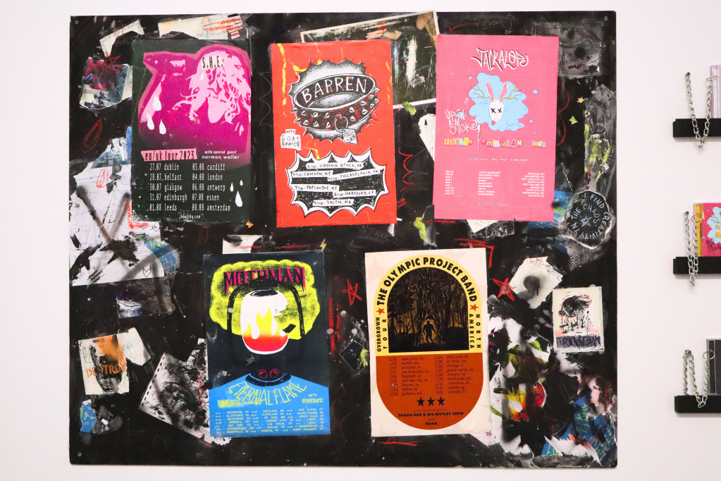
The Cryptid Concert Series is a portfolio exploration of various alternative music genres. I used a range of media and techniques from photography and digital editing, gouache painting, hand lettering, screen printing, and vector illustration.
With cryptids as a base, I analyzed the themes and aesthetics of each genre to imagine the cryptids behind the music. I then illustrated and designed album covers and gig posters to match.
Scroll down to learn more about the process and find playlists for each album!
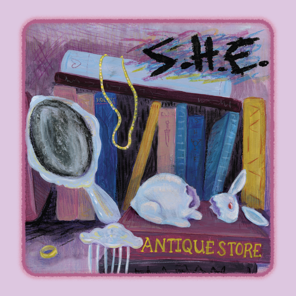
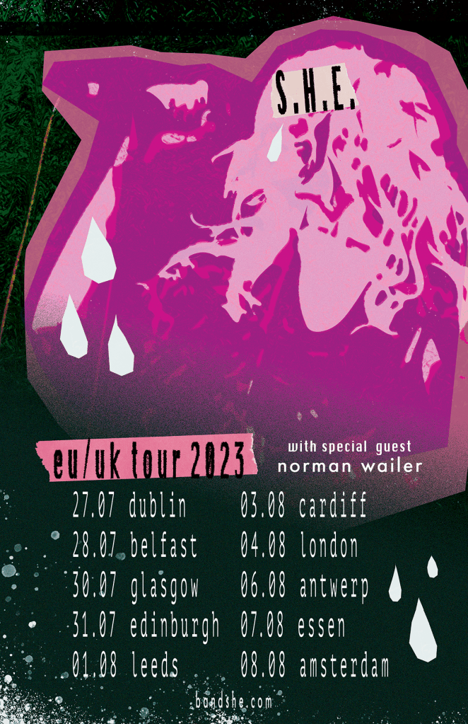
banshee * S.H.E. * indie rock
The banshee is pure raw emotion, evocative of the DIY sensibilities of indie rock. The album cover is a delicate and nostalgic gouache painting; a rabbit and silver mirror represent banshee mythology. The digitally-rendered poster is meant to capture the power of the banshee’s wail, akin to a 10-minute song full of thrashing vocals and instrumentals.
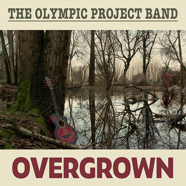
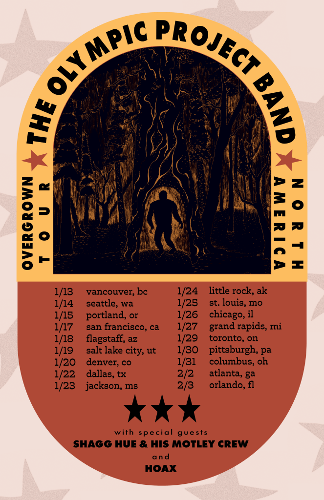
bigfoot * the olympic project band * indie folk
An acoustic guitar plucked deep within the forest to the sounds of indie folk strikes a chord within the elusive and sensitive Bigfoot’s heart. The genre has a strong photographic theme, so a tiny clay Bigfoot can be seen wandering just out of frame on the album cover. The centre of the poster is hand-drawn to elicit the delicacy and grandeur of the forest. The graphic design takes inspiration from indie folk’s simple but bold aesthetics.
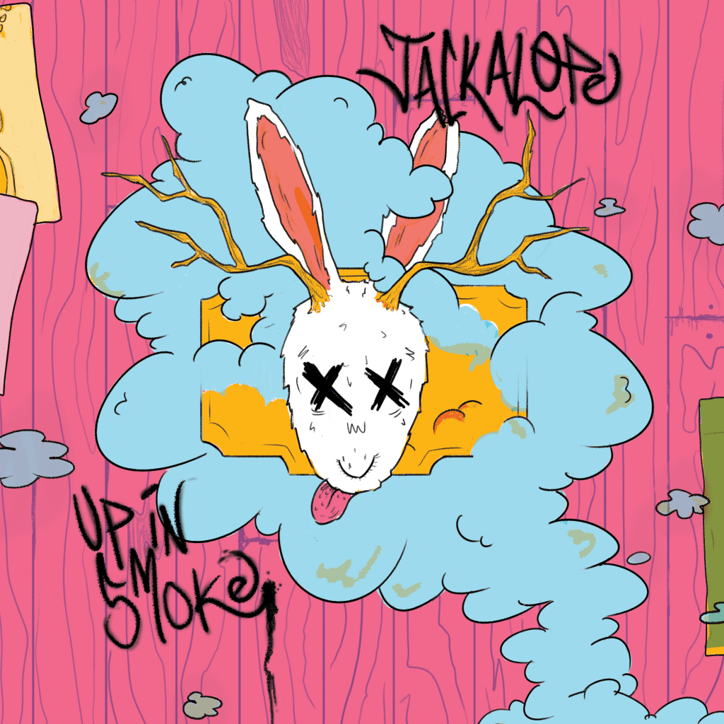
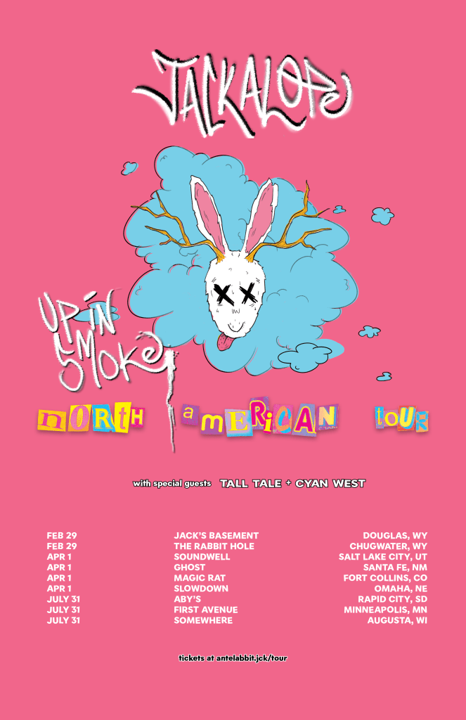
jackalope * pop punk
The most un-serious, oxymoronic cryptid of all! Jackalope is often viewed as one big practical joke. Pop punk is consistently un-serious. Its aesthetics are bright, playful and cheeky. To have fun with the CD layout, the insert unfolds into a full tabloid poster with plenty of Easter eggs from the rest of the Cryptid Concert Series. The poster riffs off the same to make a logo of the mounted Jackalope head. Both are fully digital illustrations, including the handwritten text.
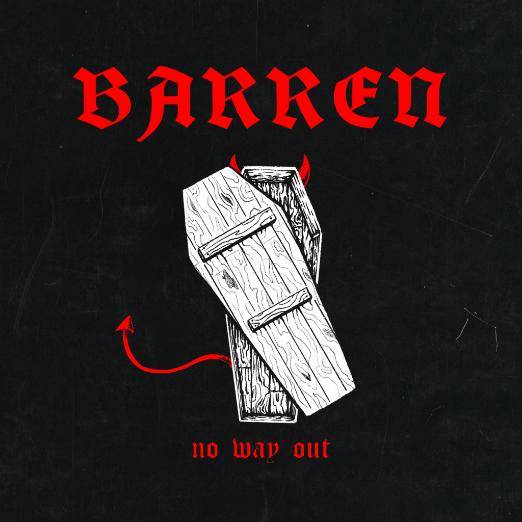
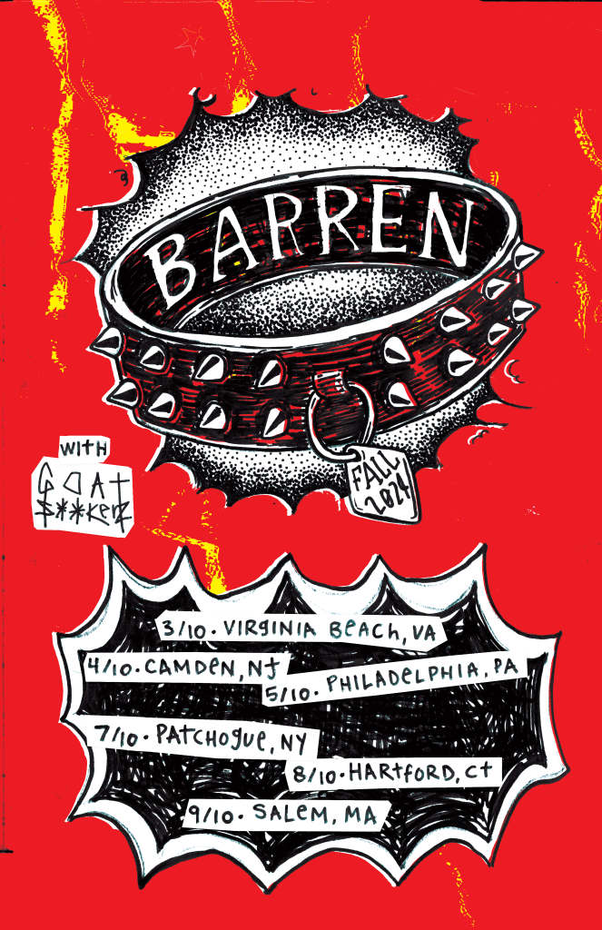
jersey devil * BARREN * hardcore punk
The ominous Jersey Devil is attuned to hardcore punk’s deep, guttural sounds. This genre’s aesthetics are straightforward and DIY. A simple iconographic album cover and a punchy poster get the message across. Both are hand drawn with marker and digitally altered.
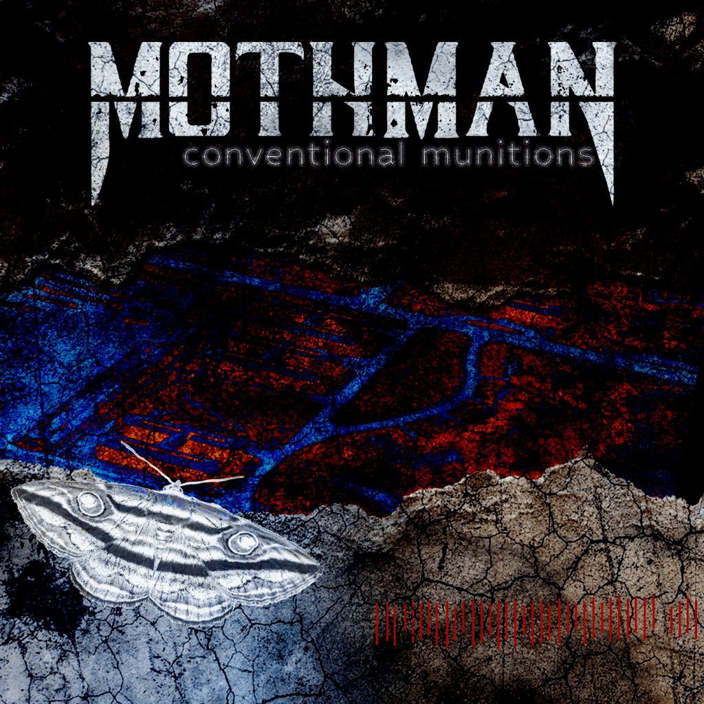
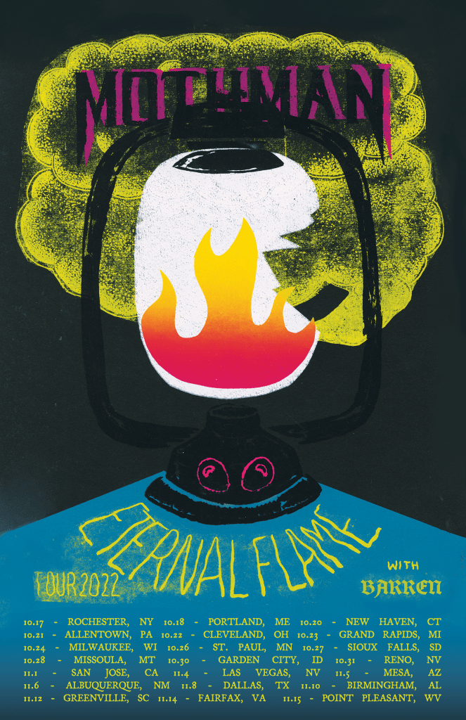
mothman * industrial goth
Mothman is the most ethereal and strange of the cryptids, so this pairing just felt right. Industrial goth is gritty and experimental, which is emulated in the album cover’s layered images and textures. The main photo is an aerial view of Mothman’s origin place, the West Virginia Ordinance Works. The poster is more straightforward, a tongue-in-cheek screen print of a broken lantern – my very first exploration into this series.